We like to think that every decision made by giant conglomerates is backed by years of research and considered decision-making, but if you’ve ever gotten close to a multi-national company, you’ll know that’s rarely the way it works. Lift a corner of most rugs and you’ll find a sick tangle of legacy procedures, insane process flows and people who think meetings are the absolute tits.
Still, I can’t shake this unthinking, instinctive consumer trust that when a major Chinese brand makes a design decision, they do it because it’s the best thing their crack UX team could come up with. I want this to be true, because often, what gets designed at the top brand level in China is copied in every other visual space, and copied so often and so ubiquitously that it becomes an unofficial visual standard.
That’s absolutely been the case with user onboarding in the Chinese digital space, with most onboarding and feature introductions using dark overlays with white arrows and line drawings.
Real Quick: What’s Onboarding Again?
Onboarding is the process of easing users into the workflow of your app or site. If they’re new users, onboarding gets them started with basic use; very clever onboarding encourages them to return frequently until the app or site has become part of their routine web lexicon.
The trend: dark overlay, white callouts with arrows
I’ve been screenshotting these bad boys every time I run into one – all this in the space of a couple of weeks.
Yihaodian
Yihaodian is an online pharmacy. The callout directs user attention to the “subscribe to a tag” feature. You’ll notice that many times, these types of callouts are used to explain the function of an icon whose meaning may not be immediately clear.

Alitrip
Alitrip is Alibaba’s foray into the travel booking industry, launched in the later half of 2014. Again, a new feature announcement, but this one encourages exploration, rather than giving an exact usage expectation.

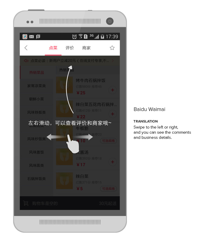
Baidu Waimai
Baidu Waimai is Baidu’s local restaurant delivery app. It’s not immediately obvious from the menu page that users may swipe left to right to see restaurant reviews and restaurant details – this overlay clarifies.
Taobao
Naturally, the big boys like Taobao are in on it. Hell, they may have invented it:

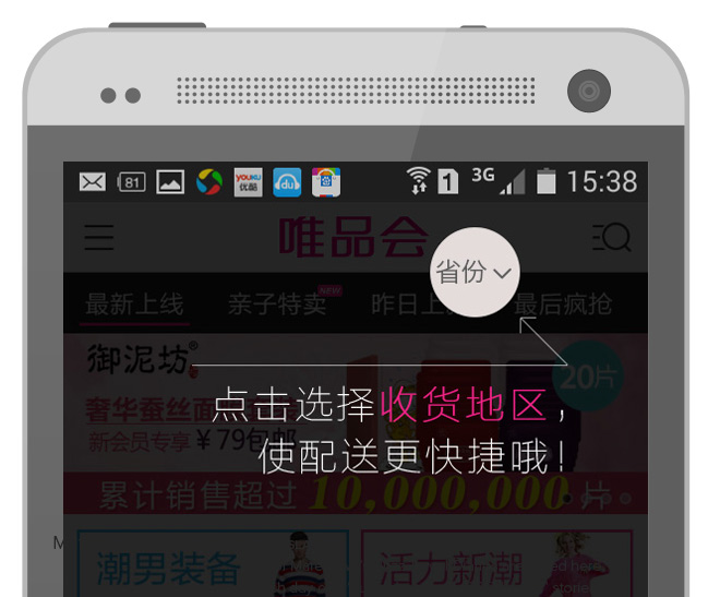
VIP Shop
More from the ecommerce arena: VIP Shop lets users know about their proximity search feature, wherein users can set a delivery location, and the search will prioritize results where vendors are closest to the recipient.

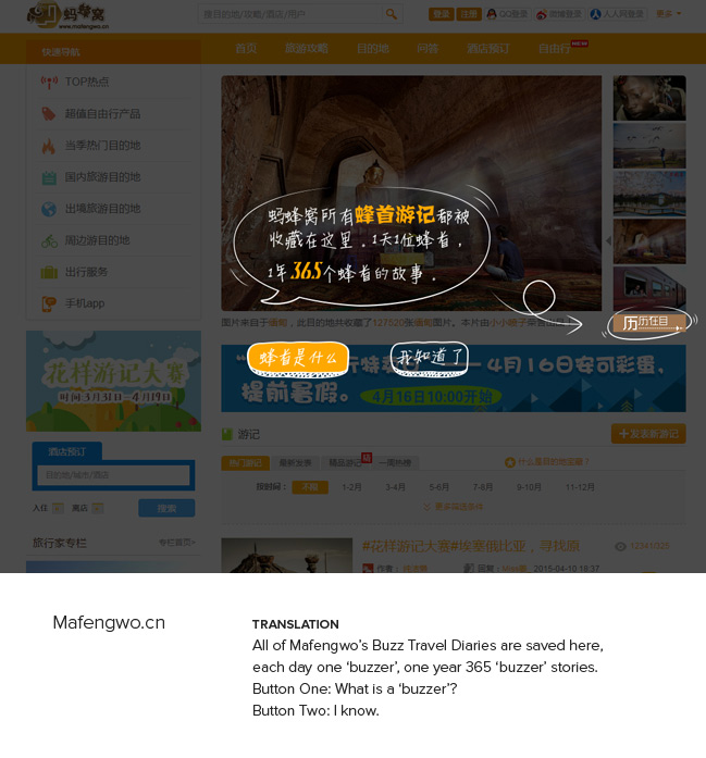
Mafengwo
Here’s one on desktop: Chinese travel experience sharing site Mafengwo introduces users to a “daily diary” feature and also to its branded term “buzzers” (蜂者). There’s no great English translation for 蜂者 – ‘buzzers’ is the best I got – but it’s a term Mafengwo invented for its travel-loving users, intended to evoke the idea of a bee or wasp that flits from one location to the next (you know, like, sampling pollen as it goes).
Seen this stuff anywhere else? Do tell.